Preview your article on different sized screens
Preview a Blog Studio article at mobile and desktop widths using the editor's Eye icon, then exit preview mode when done.
Follow the steps below on how to preview your article on different-sized screens (like mobile).
- Starting from the Blog Studio editor, click on a content block on your article to reveal the top text toolbar.
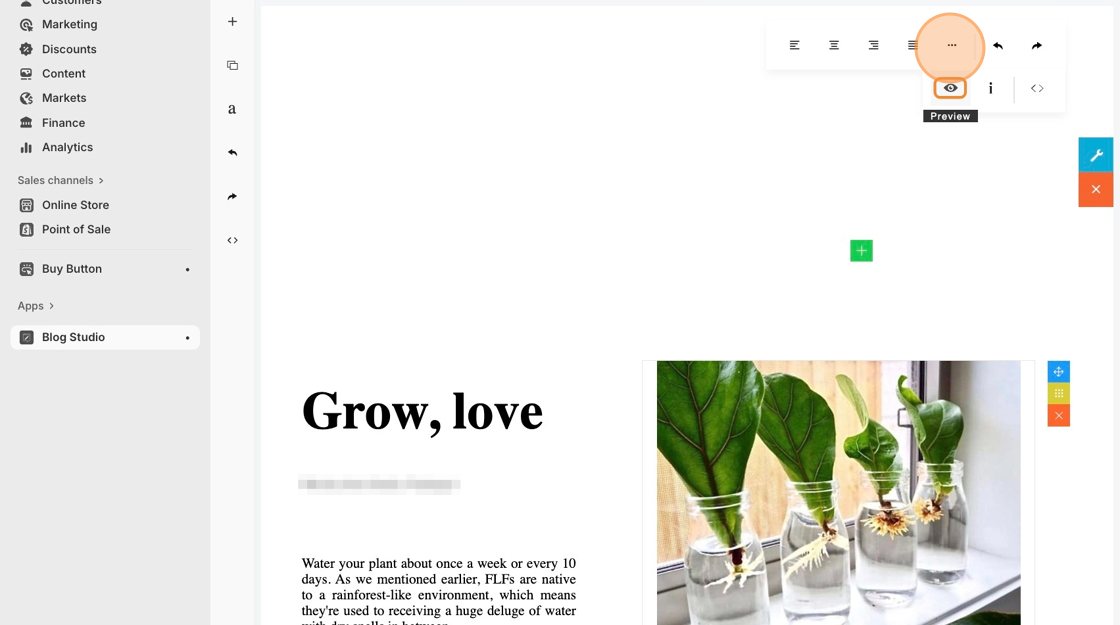
- Click on the ••• icon to reveal more advanced settings in the editor, then click on the Eye icon.
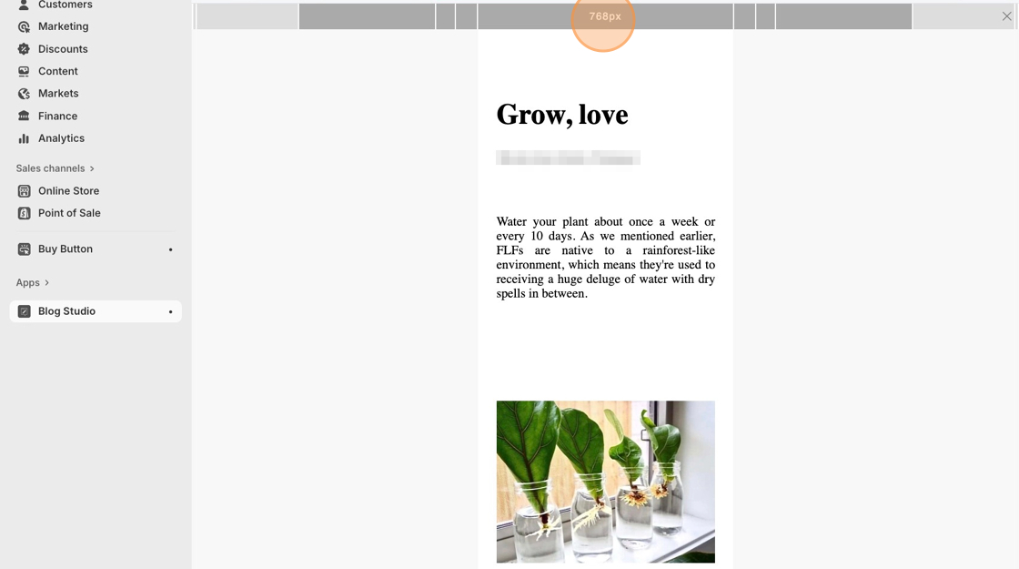
- Click on the gray top bar to freely adjust the view from mobile view to desktop view.