
Customize Swatches using CSS
Restyle Infinite Options swatches on your product pages by pasting ready-made CSS into the Custom CSS field in Settings.
Swatches can be styled with CSS code to change how they display on your product pages. Follow the steps below to customize the appearance of swatches.
1. Starting with the Infinite Options app open, navigate to the Settings section in the left sidebar.
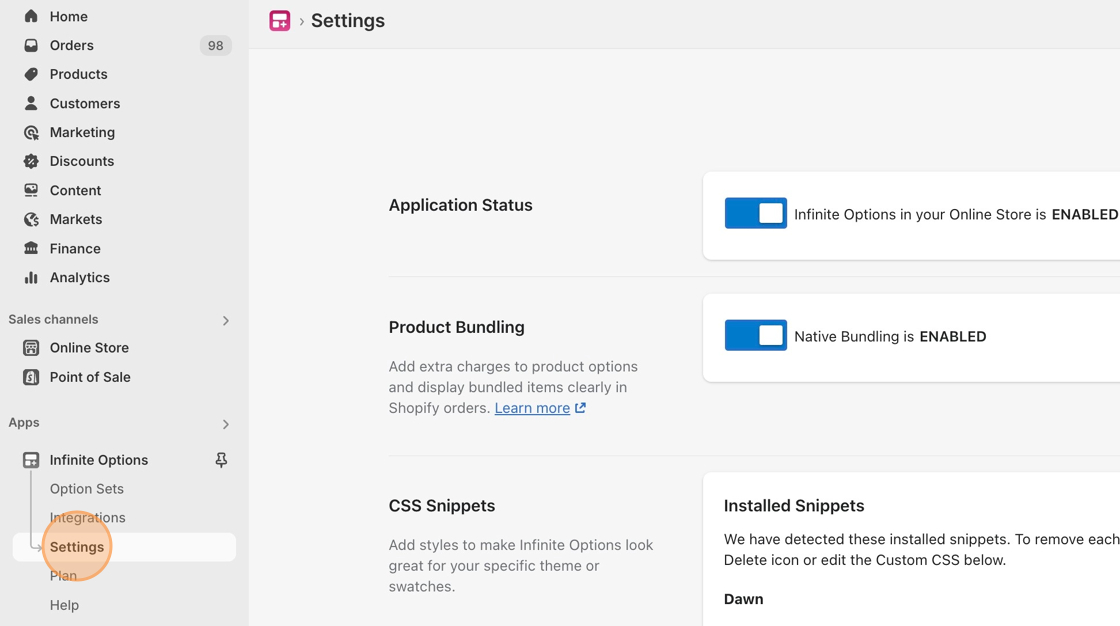
2. Locate the Custom CSS field.
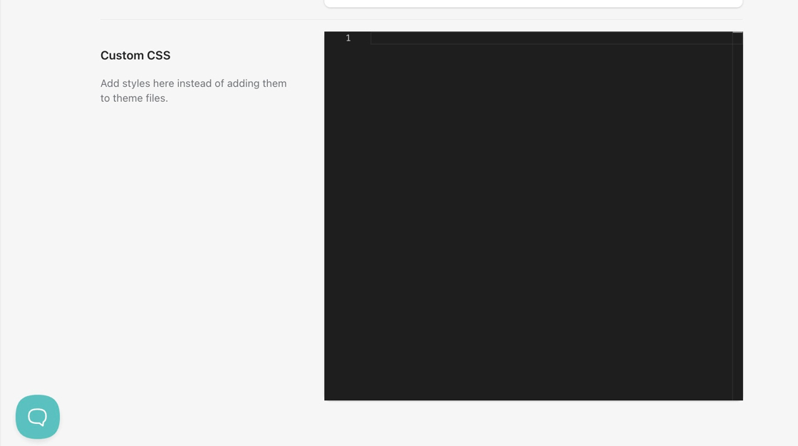
3. Copy any of the customization snippets located at the bottom of this document.
4. Insert the code snippet into the Custom CSS field.
5. Save your changes.
Looking to add hover text over swatches? Click here to learn more.
Customization Snippets
Section titled “Customization Snippets”- Large Swatches
- Round Swatches
- Vertically-displayed Swatches
- Horizontal Swatches
- Horizontal Swatches without labels
- Two-column Swatches
- Three-column Swatches
- Faded hover effect on swatches
- Add bottom spacing to swatches
- Change border color of swatches
- Apply black border on selected swatch
- Apply thicker border on selected swatch
Large Swatches
Section titled “Large Swatches”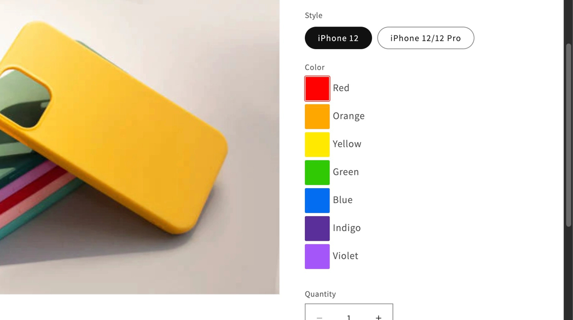
#infiniteoptions-container .spb-productoptionswatch { width: 40px !important; height: 40px !important;}Default width and height is 32px.
Round Swatches
Section titled “Round Swatches”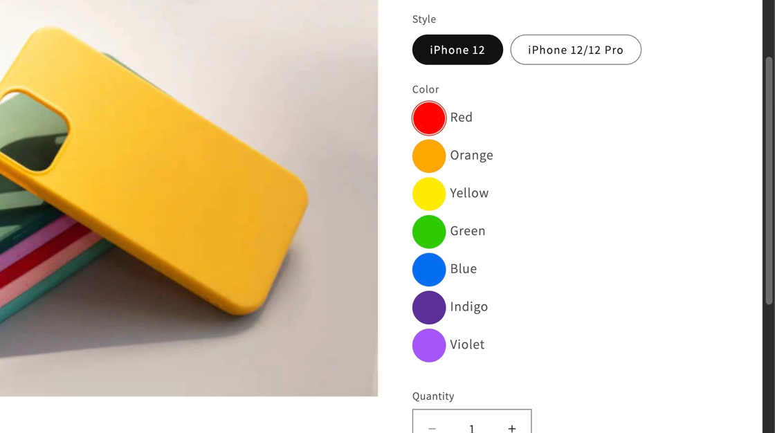
#infiniteoptions-container .spb-productoptionswatch { border-radius: 50%;}
Vertically-displayed Swatches
Section titled “Vertically-displayed Swatches”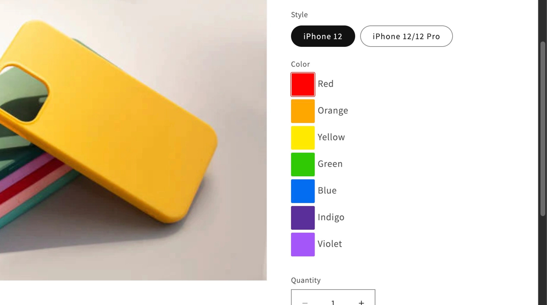
#infiniteoptions-container .spb-productoptionswatchwrapper { display: block !important;}
Horizontal Swatches
Section titled “Horizontal Swatches”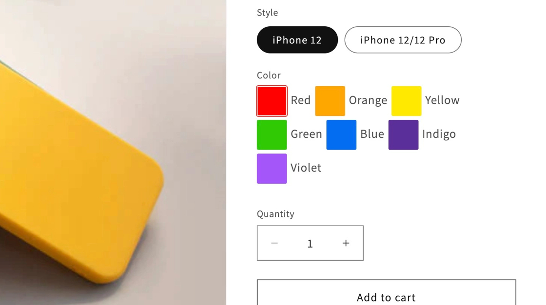
#infiniteoptions-container .spb-productoptionswatchwrapper { display: inline-block; margin-right: 5px;}
Horizontal Swatches without labels
Section titled “Horizontal Swatches without labels”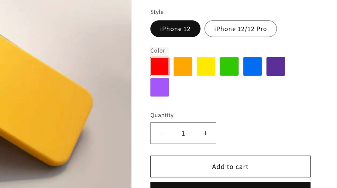
#infiniteoptions-container .spb-productoptionswatchwrapper {  text-indent: -1000px;  overflow: hidden;  display: inline-block;  position: relative;  width: 36px;  height: 36px;  margin: 0 5px 5px 0;}
#infiniteoptions-container .spb-productoptionswatch {  position: absolute;  top: 1px;  left: 1px;}
The snippet above will work best if you did not adjust the size of your swatches. If you have adjusted your swatches to be smaller or larger using the Large Swatches snippet, please adjust the width and height numbers in the first block of code to be 4px larger than your swatches.
Two-Column Swatches
Section titled “Two-Column Swatches”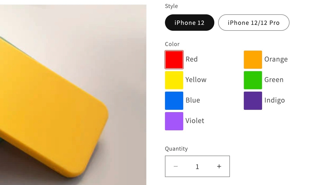
#infiniteoptions-container .spb-productoptionswatchwrapper { display: inline-block; width: 50%;}Alignment not displaying like the example?
Three-Column Swatches
Section titled “Three-Column Swatches”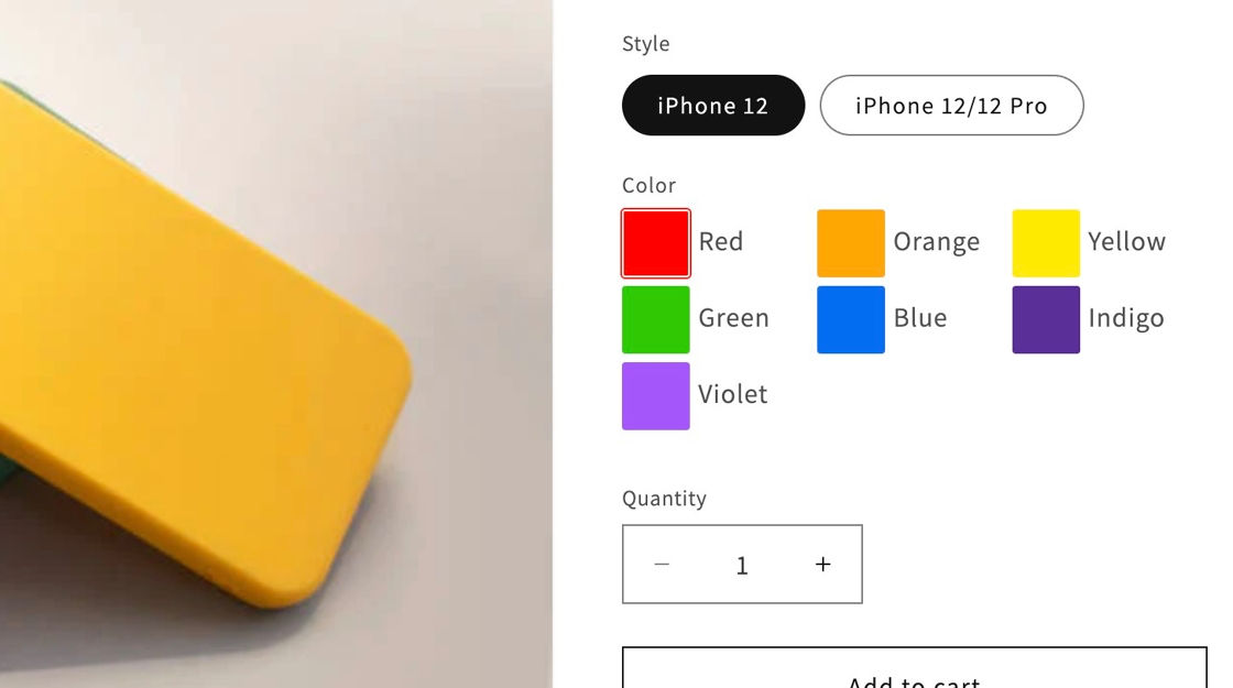
#infiniteoptions-container .spb-productoptionswatchwrapper { display: inline-block; width: 33.3%;}Alignment not displaying like the example?
Faded hover effect on swatches
Section titled “Faded hover effect on swatches”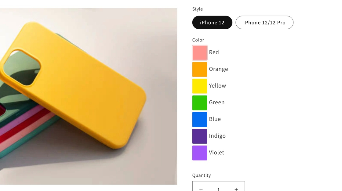
#infiniteoptions-container .spb-productoptionswatch:hover { opacity: 0.5;}
Add bottom spacing to swatches
Section titled “Add bottom spacing to swatches”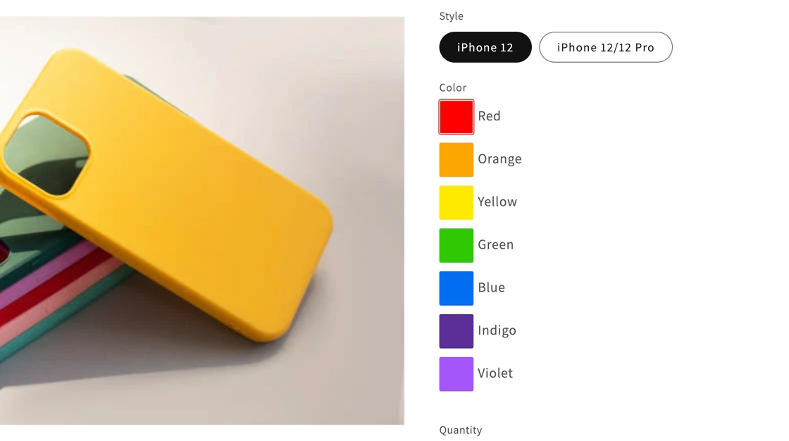
#infiniteoptions-container .spb-productoptionswatchwrapper { padding-bottom: 5px !important;}
Change border color of swatches
Section titled “Change border color of swatches”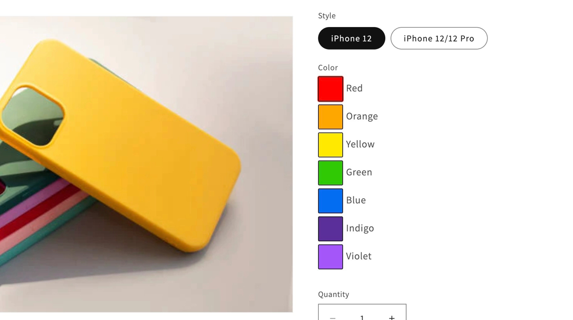
#infiniteoptions-container .spb-productoptionswatch { border: 1px solid #000000 !important;}#000000 is the hex color value for black.
Apply black border on selected swatch
Section titled “Apply black border on selected swatch”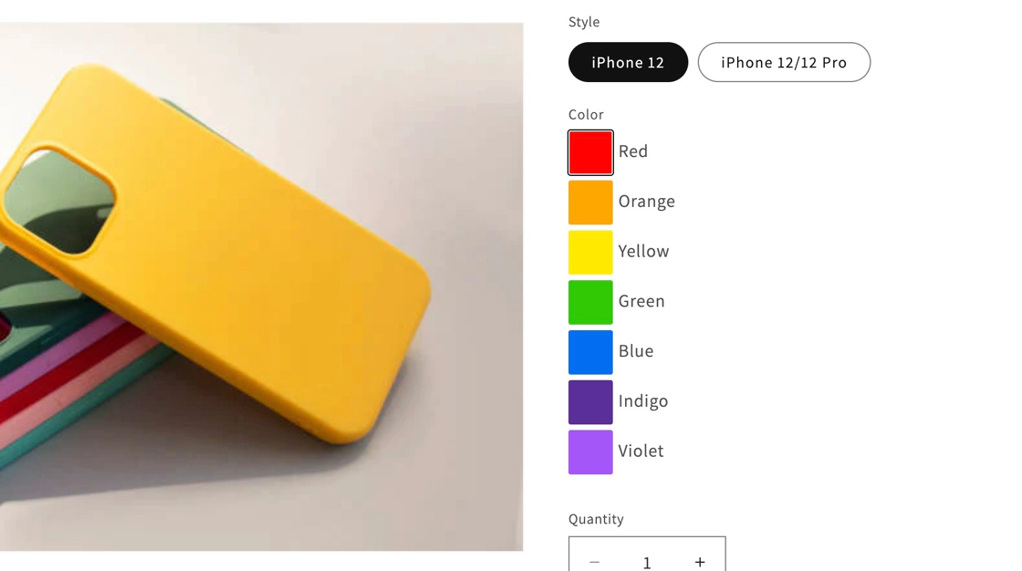
#infiniteoptions-container .spb-productoptionswatchwrapper input[type="radio"]:checked + .spb-productoptionswatch,#infiniteoptions-container .spb-productoptionswatchwrapper input[type="checkbox"]:checked + .spb-productoptionswatch { box-shadow: 0px 0px 0px 1px #000000 !important;}
Apply thicker border on selected swatch
Section titled “Apply thicker border on selected swatch”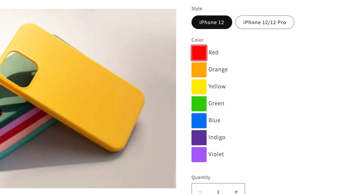
#infiniteoptions-container .spb-productoptionswatchwrapper input[type="radio"]:checked + .spb-productoptionswatch,#infiniteoptions-container .spb-productoptionswatchwrapper input[type="checkbox"]:checked + .spb-productoptionswatch { box-shadow: 0px 0px 0px 2px currentColor !important;}